
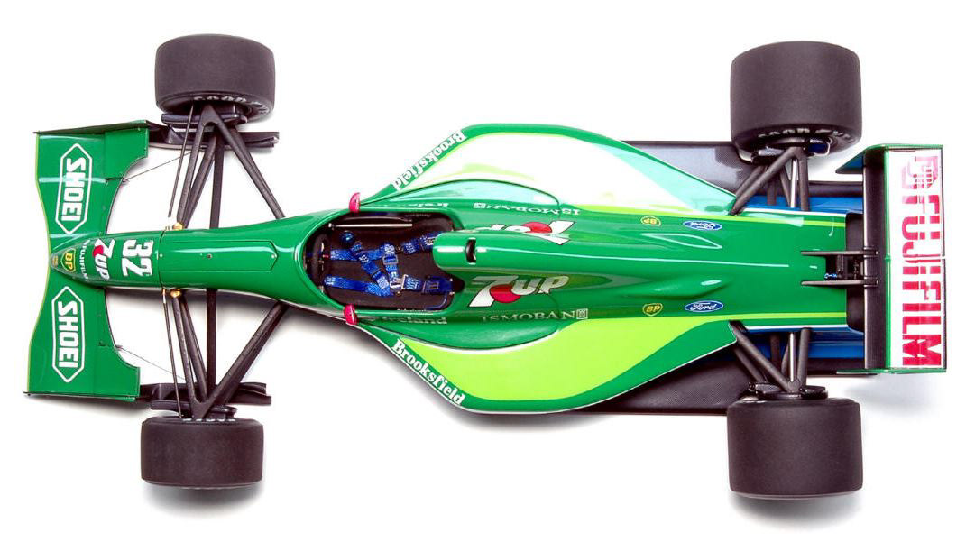
I initially started this project in November of 2014 before dropping it over Christmas, and by the time I could return to it I had lost the drive to progress further. This was part of a wider issue where I was simply too busy to work on personal illustration projects and when I finally did have the time, I couldn’t get an idea or technique past the initial exploration stages.
Midway through July I was planning another project (a Le Mans illustration that went nowhere) when I opened up my initial Jordan 191 file and started to add details to the rear wing. It was a time consuming process but by the end of the first evening I knew I was going to push forward with this project at last.
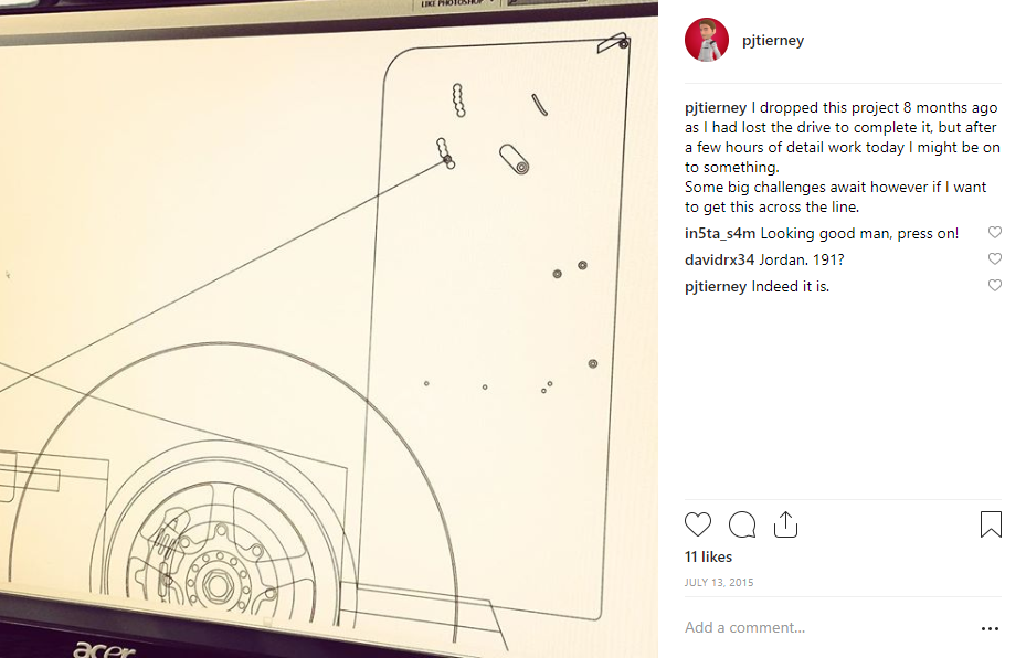
The basic body shapes were already mapped out last year, so I already had a good foundation to work from. I spent quite a lot of time on the shaping itself, using a lot of reference material. It could have been a bit quicker had I found the right image and traced an outline, but something about that just feels wrong to me.
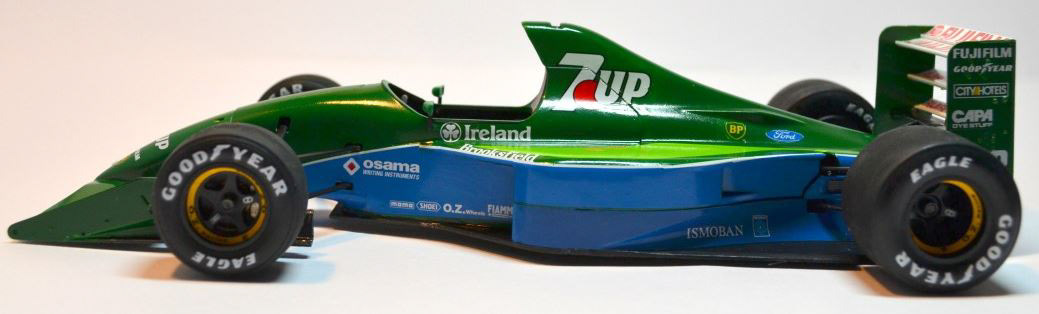
I gathered about 20 images or so, from scale models to race photos and through inspecting them I noticed a lot of small details that I wouldn’t have found otherwise. Through my research I also found this model making thread, where somebody spent a number of years making the “perfect” Jordan 191 scale model. His progress pics and additional information about the real car were a valuable resource in helping me maintain accuracy in my illustration.
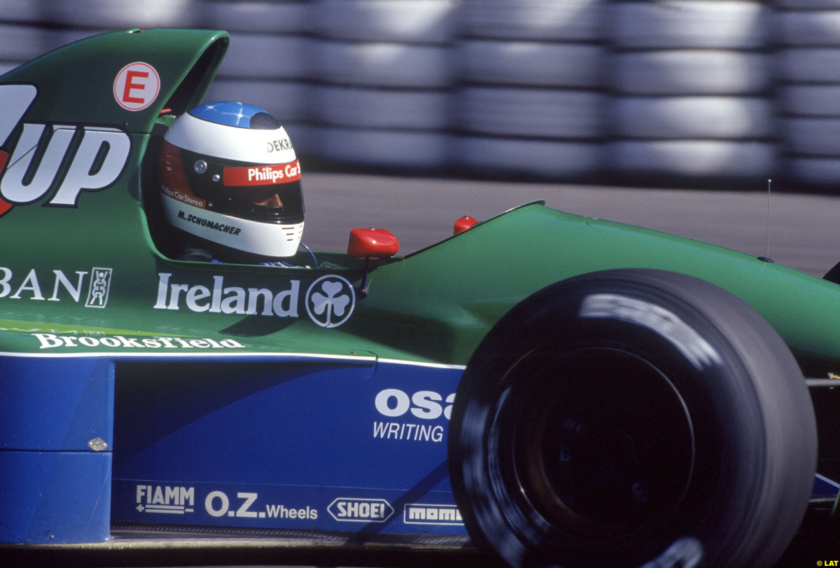
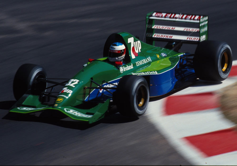
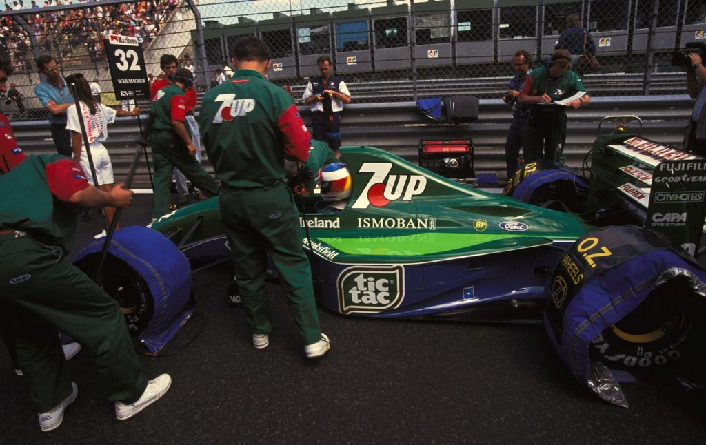
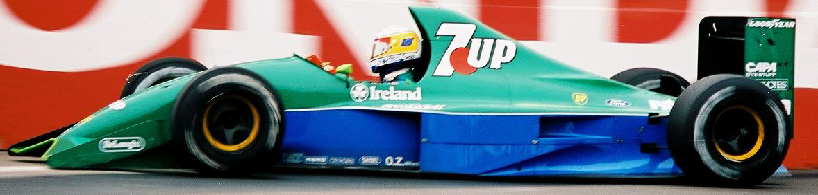
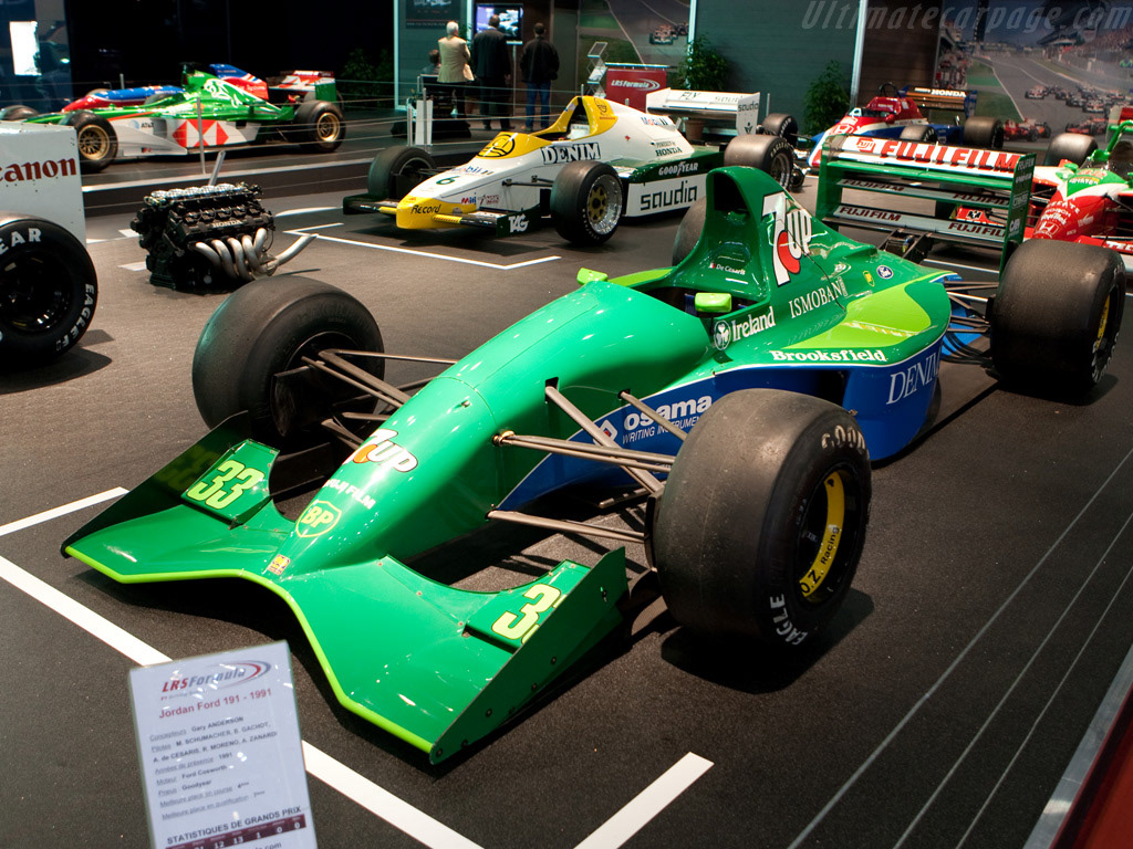
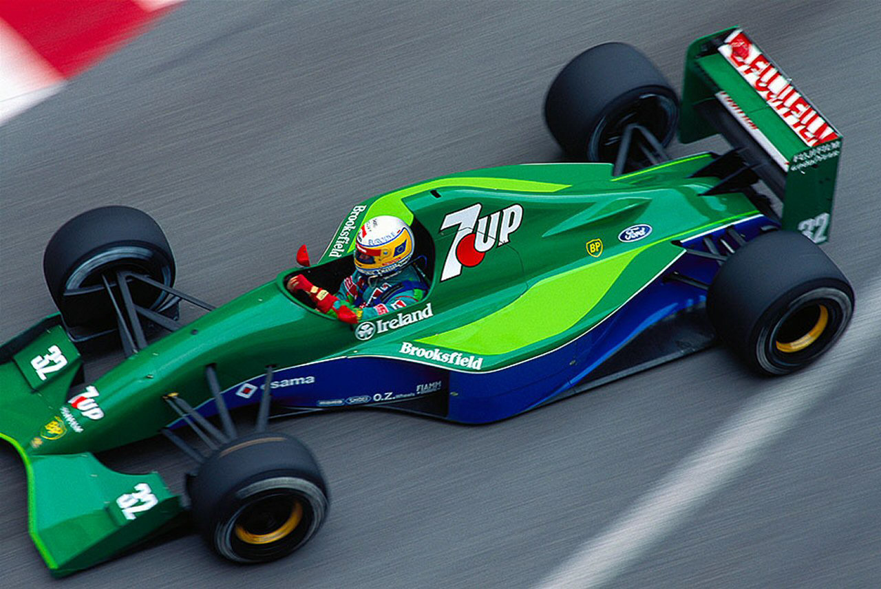
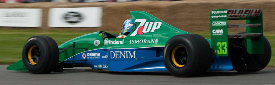
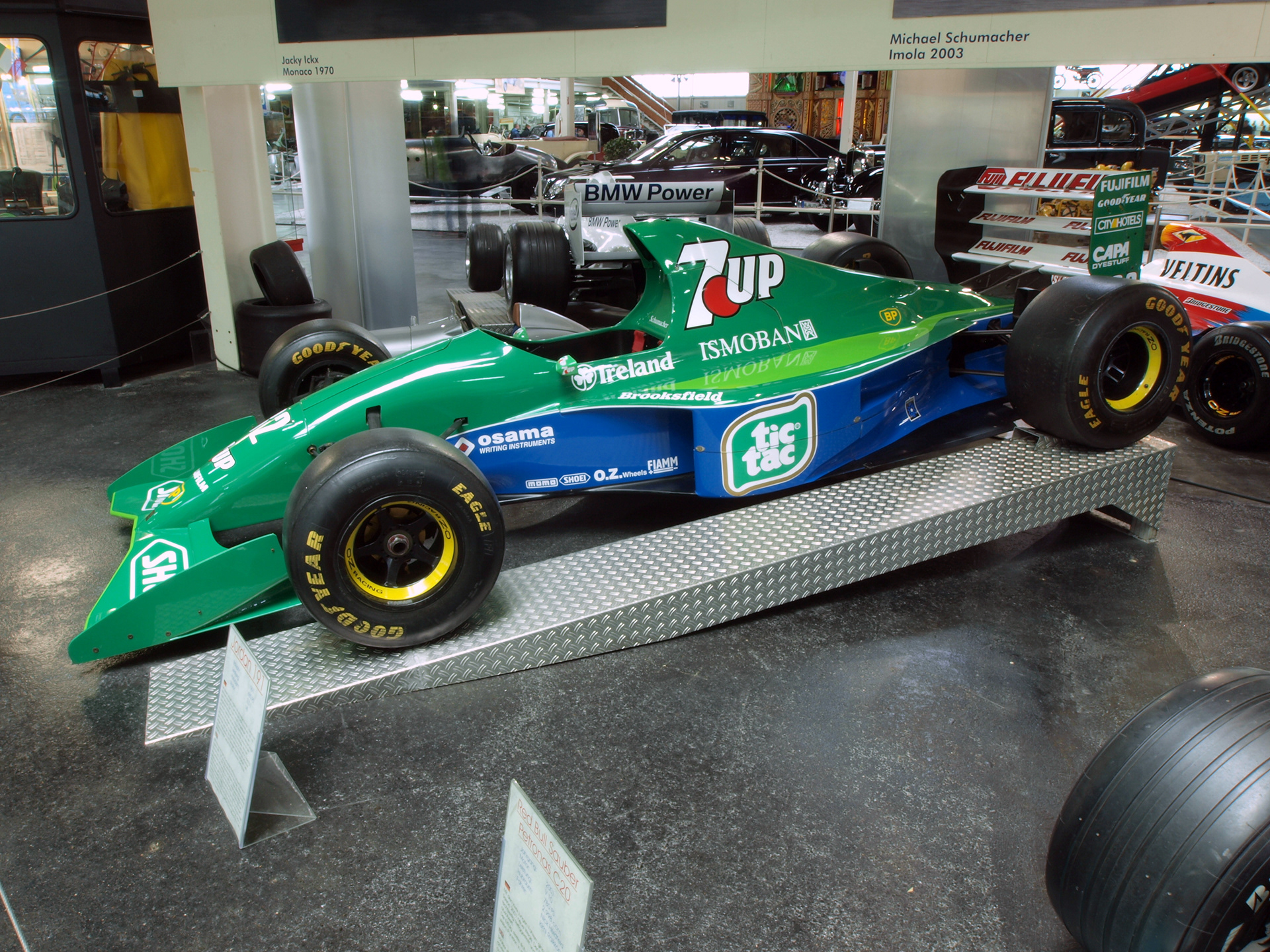
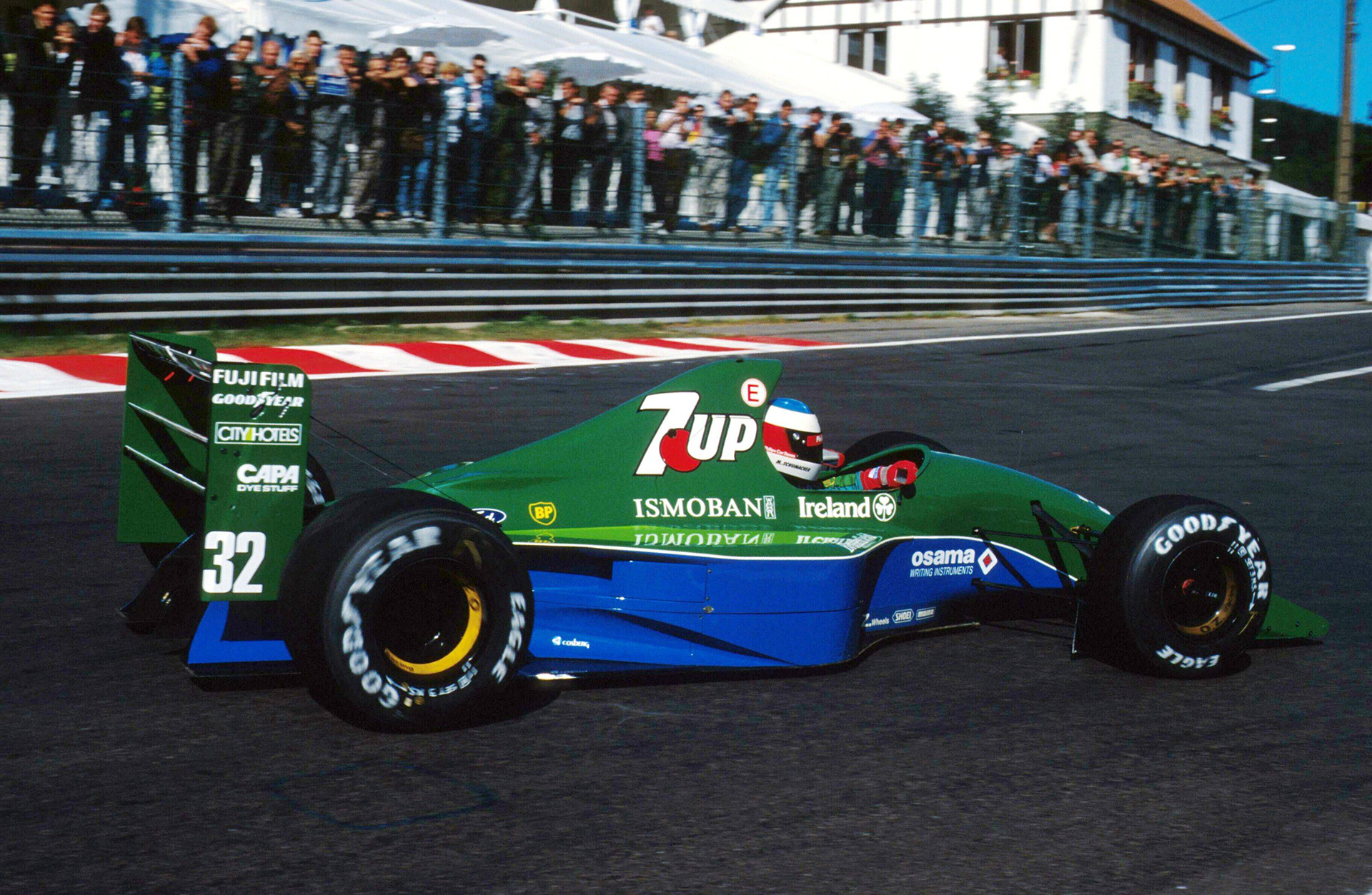
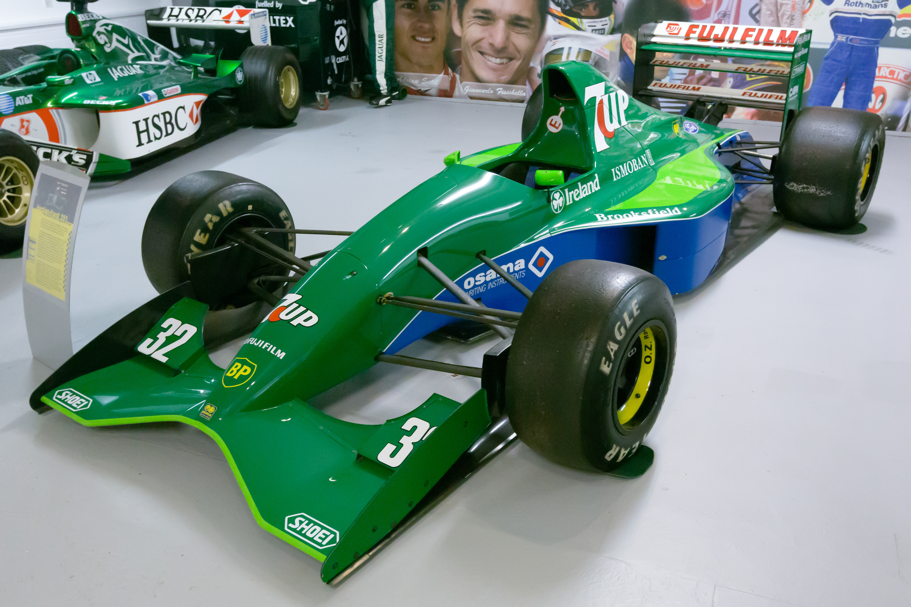
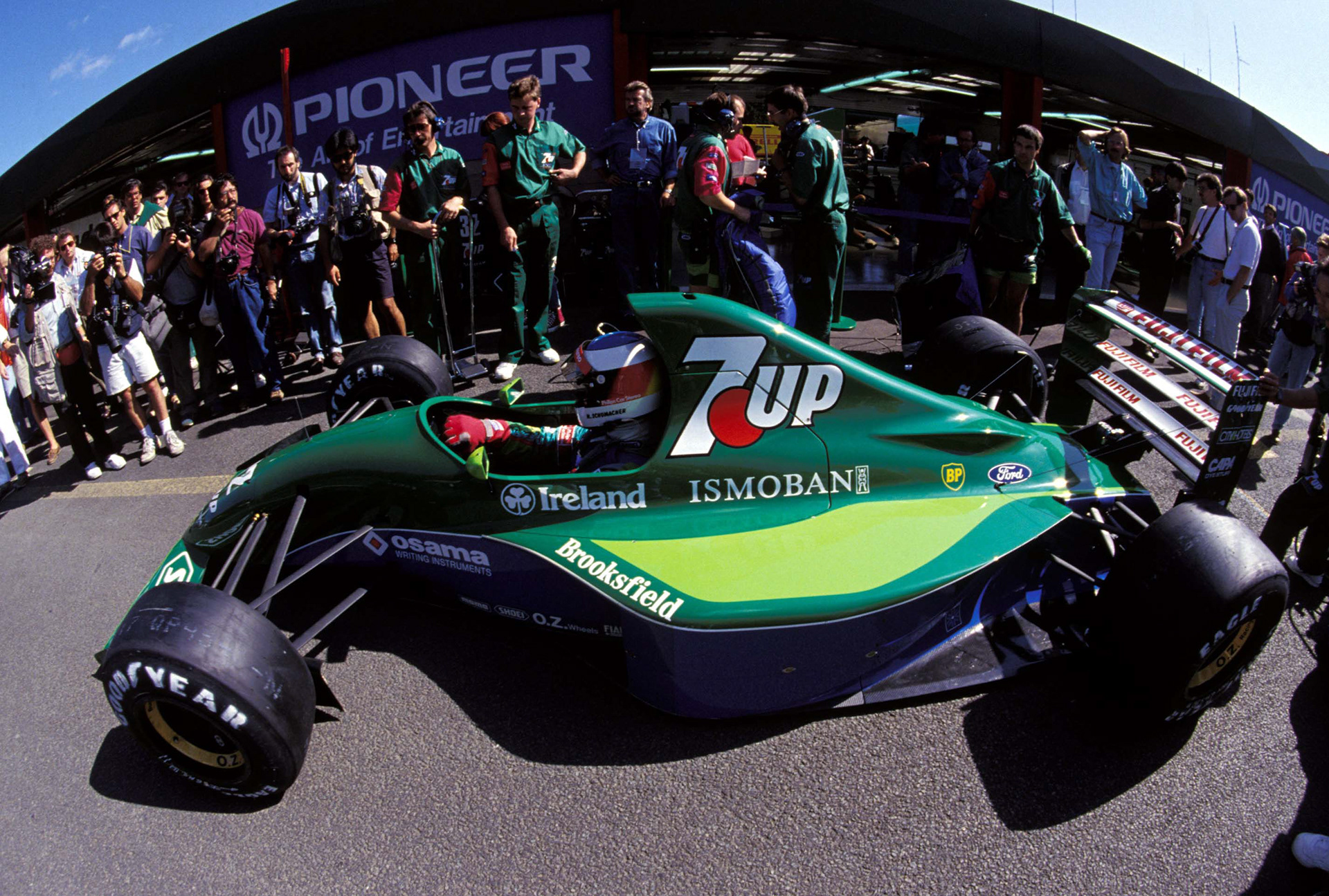
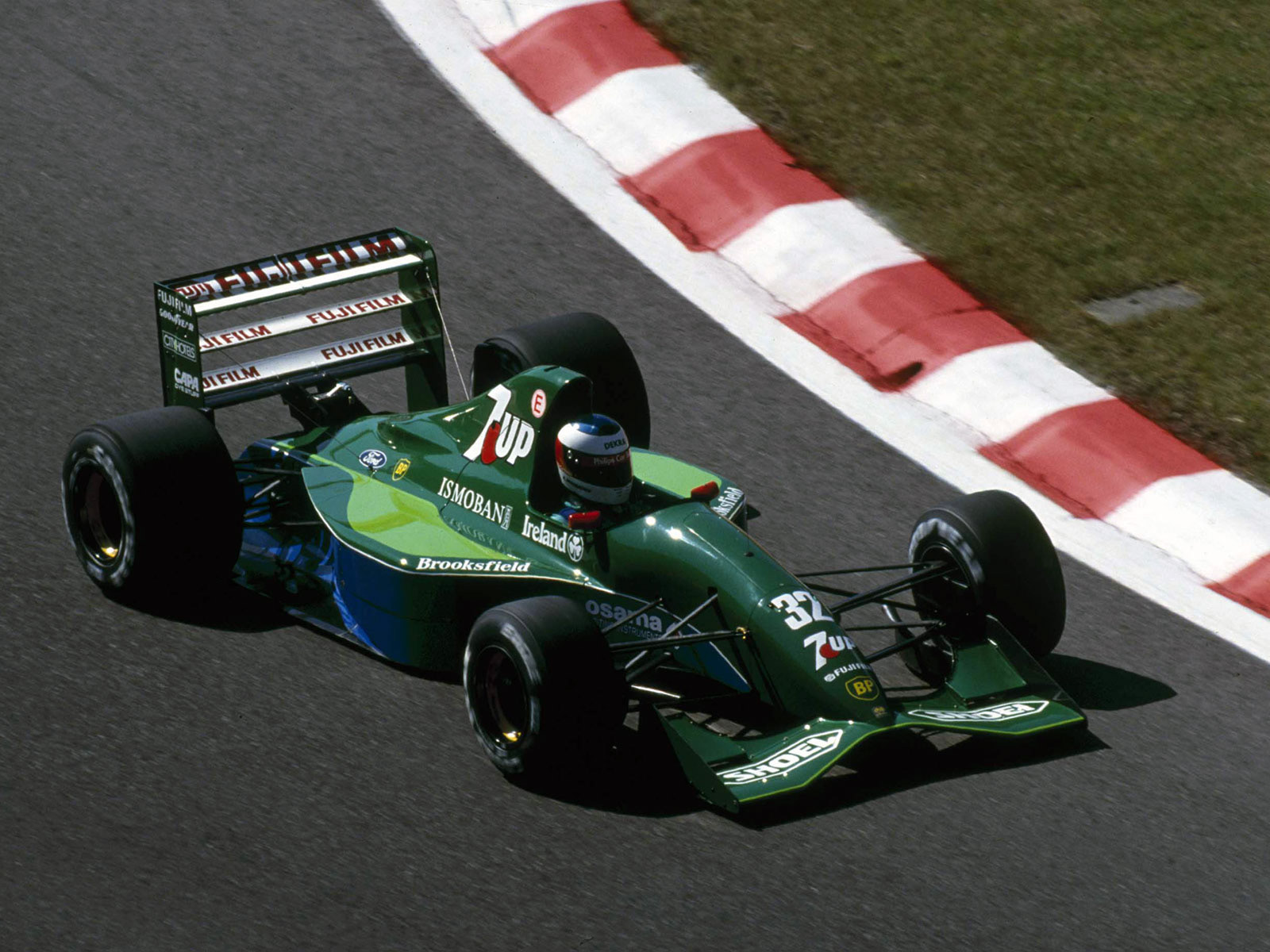
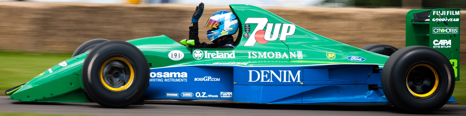
The real car changed throughout the season, and even varied from session to session on a race weekend. Minor body changes would occur and sponsorships would change as the team became more successful in its first F1 season. Modern photos were tricky as well as parts of the livery and bodywork were changed for various reasons.
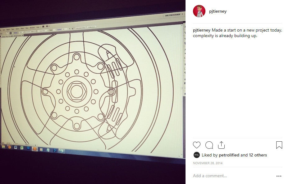
For a project like this I generally have 3 stages when it comes to the main illustration. The first is to draw everything flat in a gray colour, with a subtle outline on each shape to help me define everything.
Following that I apply lighting and shadow above the base shapes, and to finish I create the logos and place them in between the shapes and lighting so that they sit well with the overall look and don’t look “pasted on”.
It is a technique I saw another artist use to great effect many years ago which I then reverse-engineered and elaborated on to find my own way of doing things. If you're interested I shared this creative process with Digital Arts in one of their magazines. The process back when was done in Adobe Photoshop and while the Jordan 191 was to be drawn in Adobe Illustrator the basic theory is similar.
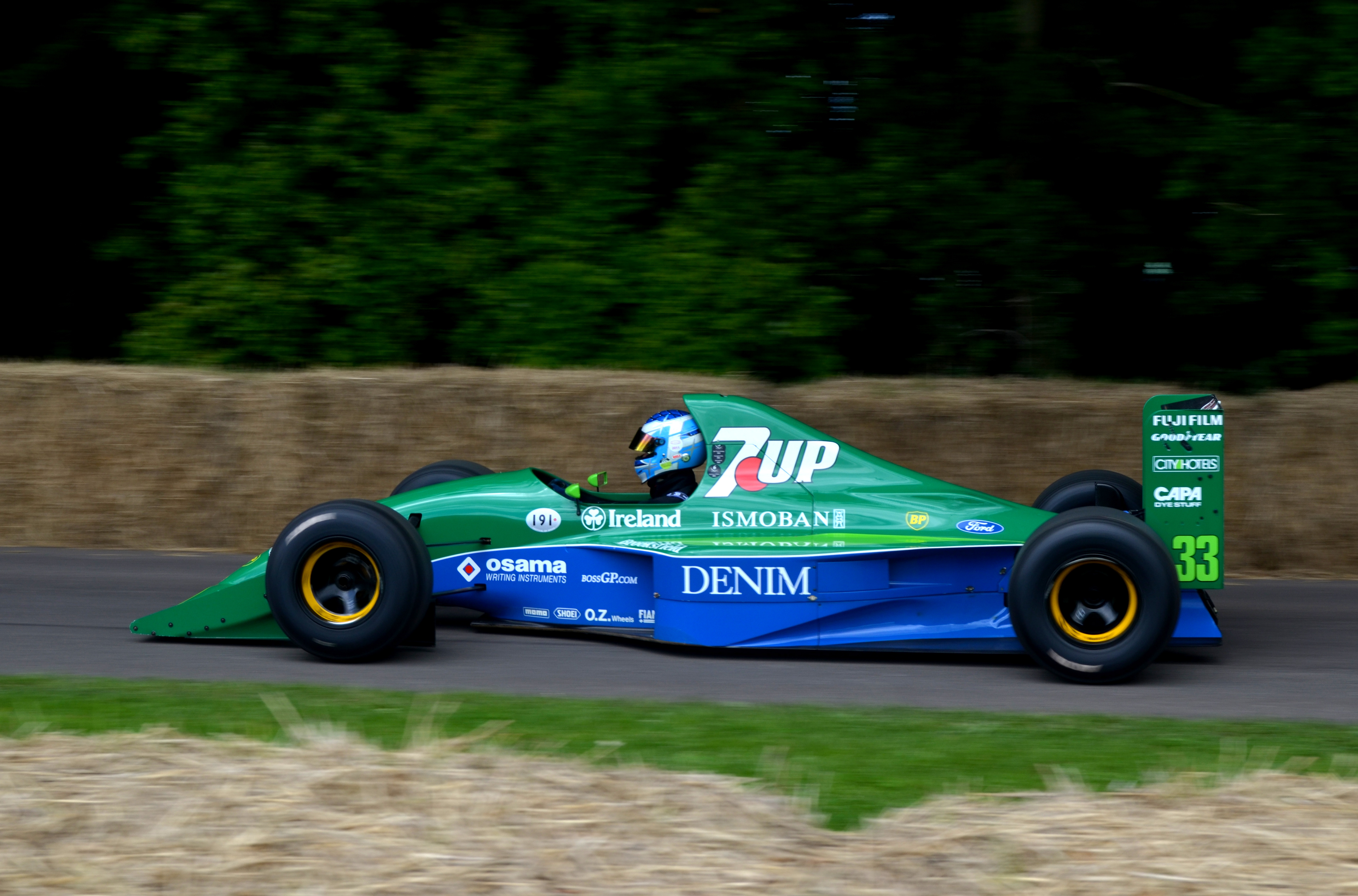
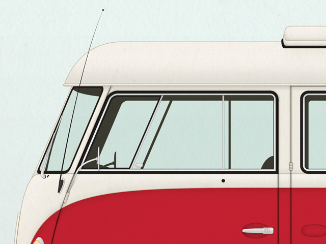
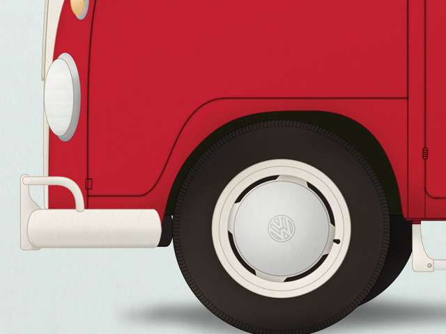
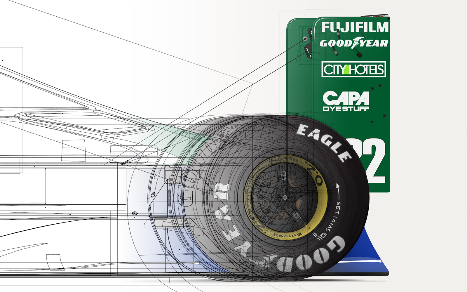
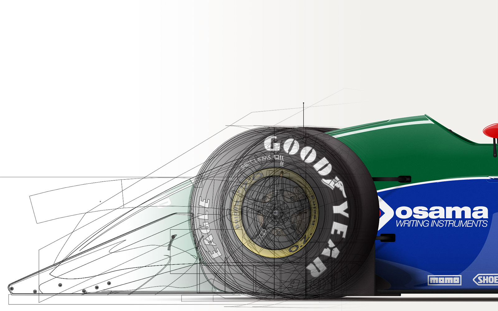
From an early point I made the decision to have no outlines on the shapes of the final illustration, and to light the entire car in vector graphics. This was a big step up from the Camper Van project I did in 2013 (see below) but one I felt I needed to pursue. Comparing the Camper Van to the Jordan clearly shows that the effort was worth it, as the Jordan looks less "cartoony" than the Volkswagen.
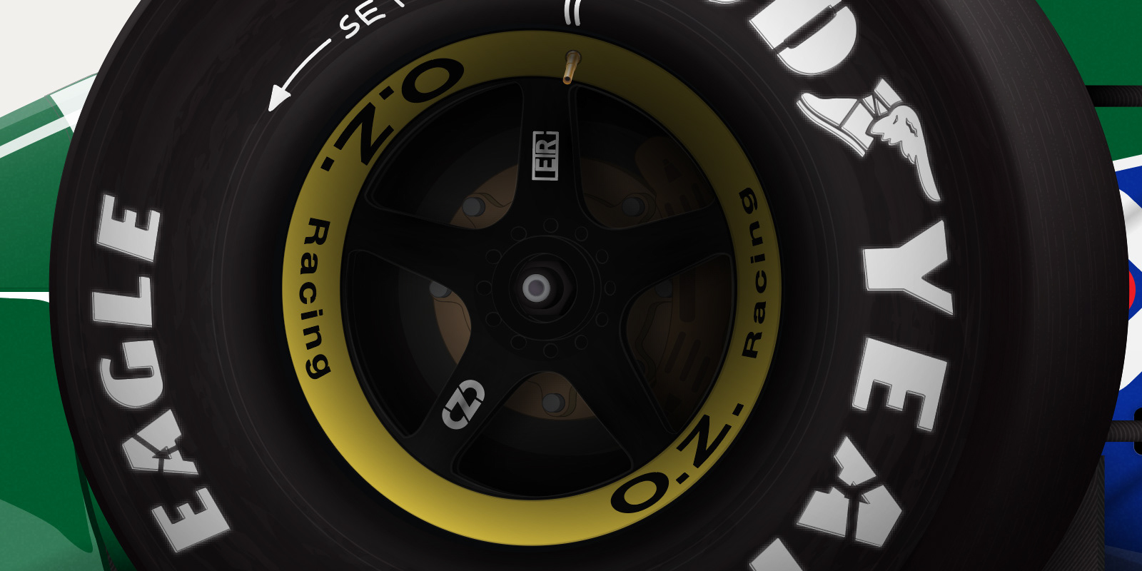
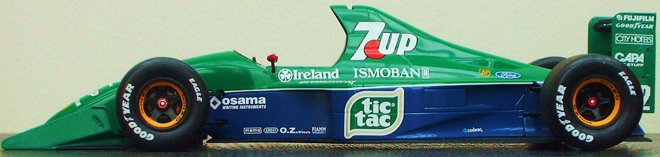
The wheels were the toughest part of the entire process. Once I had the initial shapes blocked in I wasn’t happy with how the wheels looked in 2D space, so I made the decision to add a perspective to them (and also to the entire car). That was rather tricky to begin with but eventually I found the right method to adjust my flat shapes in a believable manner.
When it came to the lighting the wheels were also a big challenge, as the rounded surface and non-glossy material meant applying a large number of subtle gradients and shapes to get a believable effect. I wasn’t sure how it would all work out until I put the branding on them, as without the Goodyear logos they looked rather “plasticy”.
The logos were another tricky aspect due to the shape of the car. The bodywork consisted of several rounded or sloping areas where a straight line just wouldn’t make sense. For this I gave myself a crash course in Envelope Distortion, using different distortion methods depending on where a logo would be located.
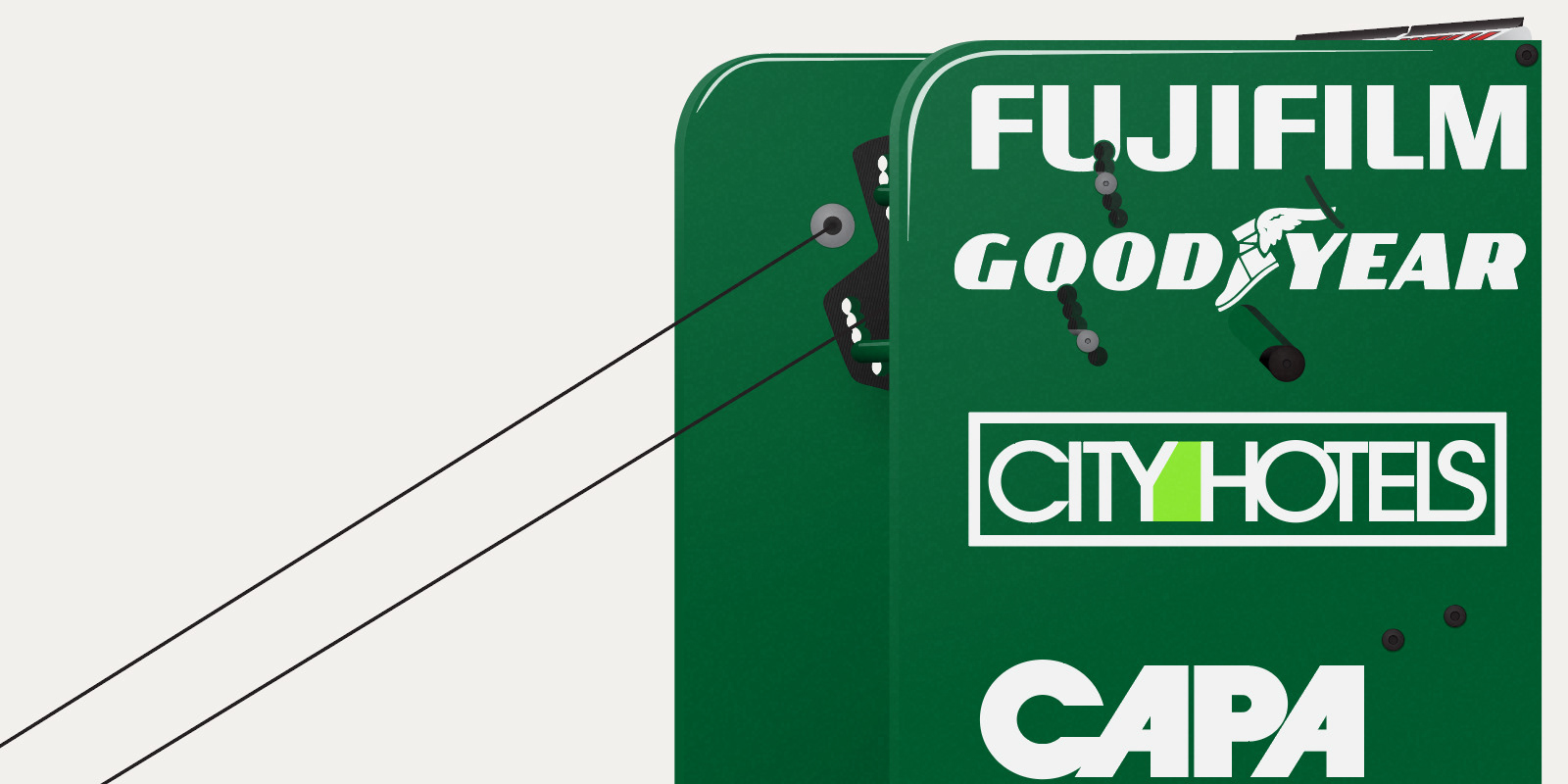
Getting the right logos to begin with was also a challenge, and despite the vast resources of sites like Brands of the World I ended up having to draw several logos by hand. For many of these the only notable place they were seen was on this car, (this was 1991 remember, it’s not like today where every big company has its own web presence and a consistent branding system) and they had to be period correct as well as corporate logos change over time.
I ended up spending an entire day trawling through resources and drawing logos, and another in applying them to the car. Decal sheets for scale models were a surprisingly useful reference point.
Towards the end of the project my computer was struggling to keep up. Fine adjustments on the wheels in particular took a long time as every time I made a tweak or drew a path the illustration would re-render itself. I couldn’t exactly work in Outline Mode either as I had drawn so many paths and my screen would look like a tangled web. Program crashes were inevitable but fortunately I was saving often and when Illustrator did give in (3 times in one day) I hadn’t lost any progress.
By the end of the project I reckon I put in about 80 man-hours or so, easily making this the most complex illustration I’ve ever done. I’m quite proud of this one as I learned a lot from it, and can apply the various techniques I picked up to future projects.
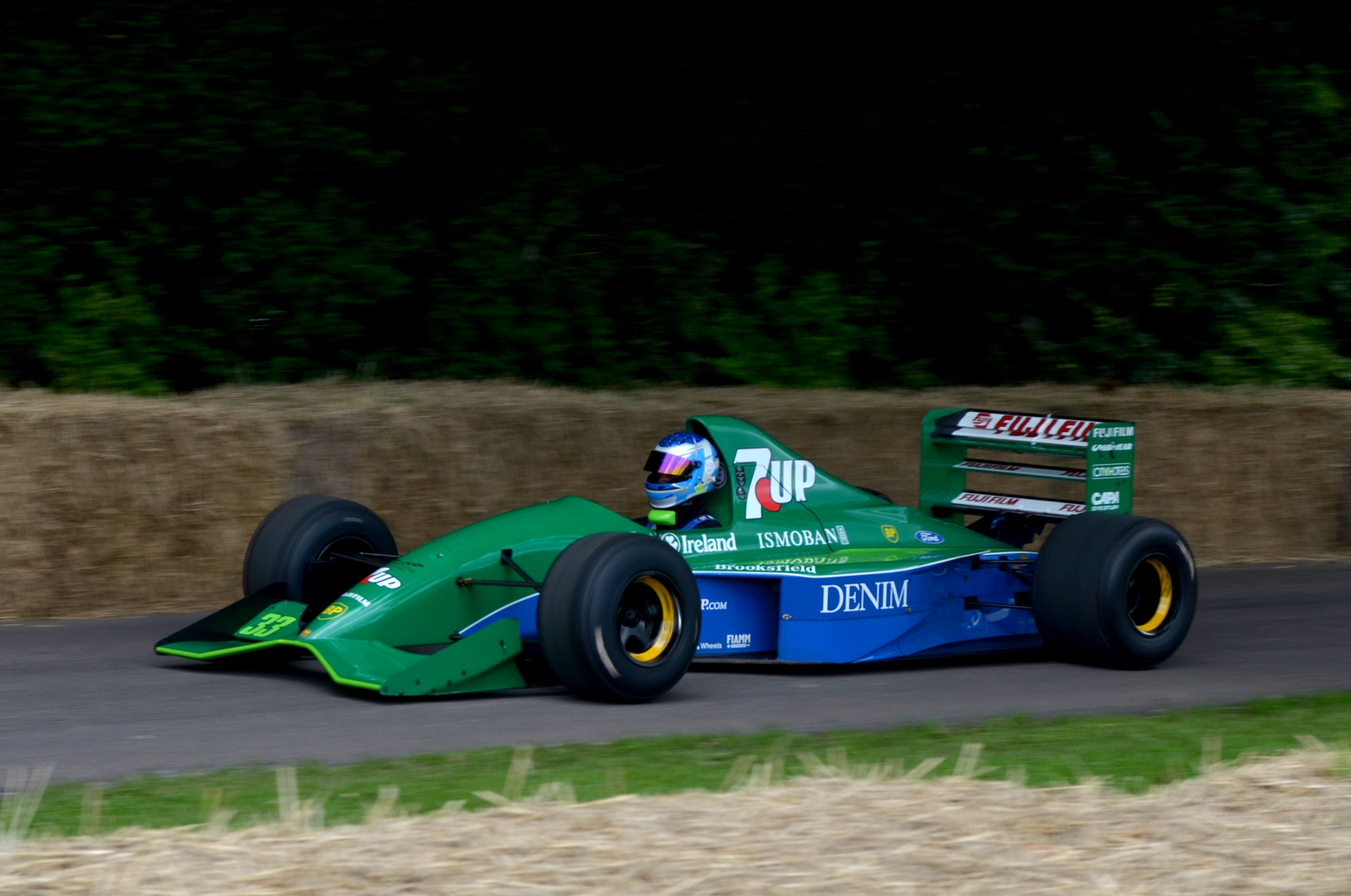
Michael Schumacher was my favourite Formula 1 driver when I grew up, and being Irish I had a keen interest in the fortunes of Jordan Grand Prix from the moment I started to actively follow the sport. The Jordan 191 is legendary amongst those who have followed racing for a long time, and it is a great feeling to put such effort into this tribute piece.
Any trademarks, logos, and brand names represented in this illustration are the property of their respective owners. No connection with any company is to be implied unless otherwise stated.