
Forza Horizon 3 is an open-world racing game set in a condensed version of Australia. As with previous titles, the game is themed around the Horizon Festival, a place where people can race and show off their favourite cars while taking in the beautiful sights and sounds of the Australian landscape.
Throughout most of 2017 I spent many hours in this fictionalised world, creating custom car designs, competing in time trials and generally having a good time with a vibrant and creative virtual racing community. Over time I came to appreciate the hard work that Turn 10 Studios and Playground Games put into creating this world and how its roads contributed to good race route design.
While looking at the Rivals (ie: Time Trials) mode in-game I wondered what the in-game map would look like if all of its race routes were on display at once. Which roads were the most popular, which weren’t used at all, and how do these routes string together to make an open world environment worth driving on? That gave me an idea, to create a map.
I started this project with initial concept sketches in March of 2017. At the time my main focus was on coming up with a logical way of displaying multiple routes on the same road, similar to how the London Tube Map handles the routes surrounding the Circle Line. I scribbled down some notes in an evening and put it away until I felt ready enough to properly start the project.
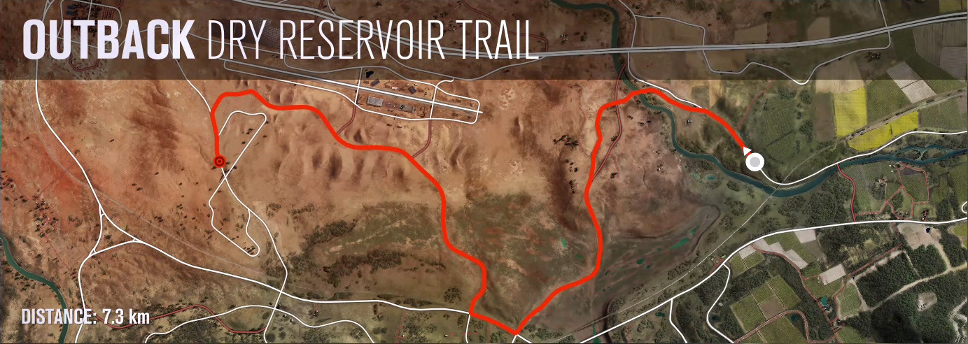
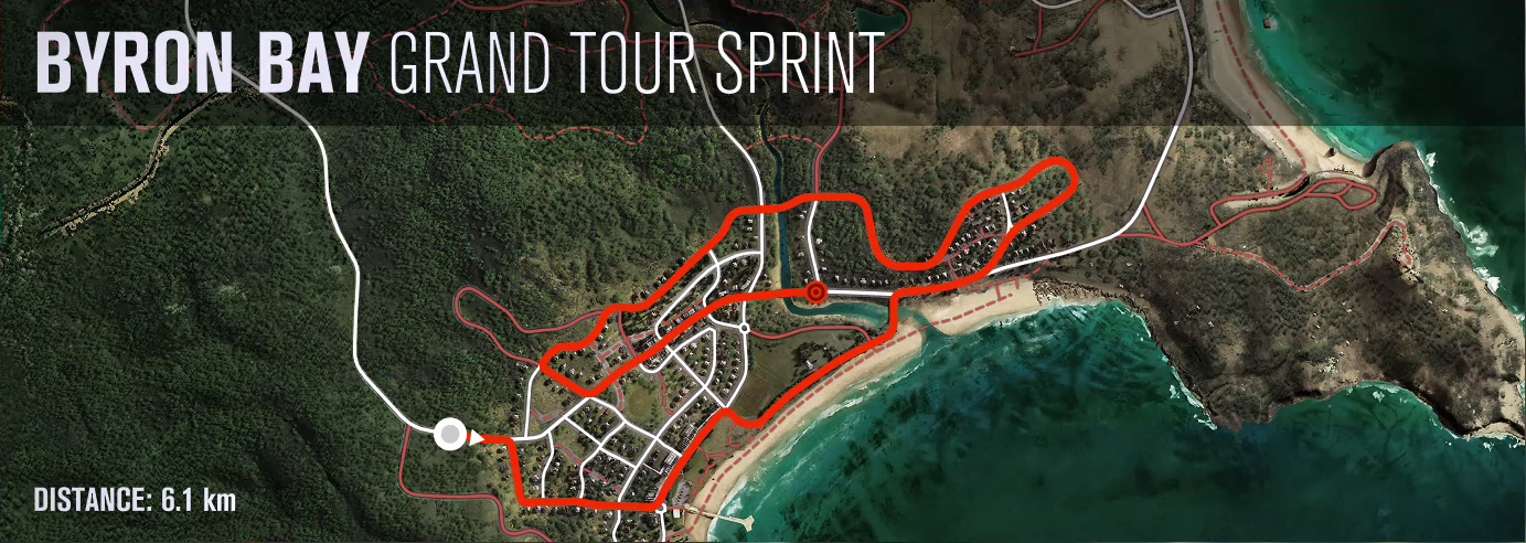
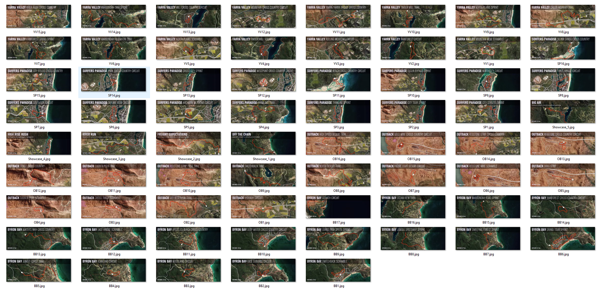
After a few weeks of thought and convincing myself to take that first step I started doing research in April, taking screenshots of the in-game map and scenery. I also captured images of all 69 race routes on the game’s main map (below) which would form the basis of the entire project.
Come July I still hadn’t opened Adobe Illustrator but I was thinking about the project all the way through. I knew this would be a “dip-in, dip-out” project as my day job can get quite hectic sometimes, and the last thing I want after a busy day is to sit in front of another computer for several hours. Things had calmed down enough in the Summer for me to revisit this however, and once I started I was able to commit more time to it in the coming months.
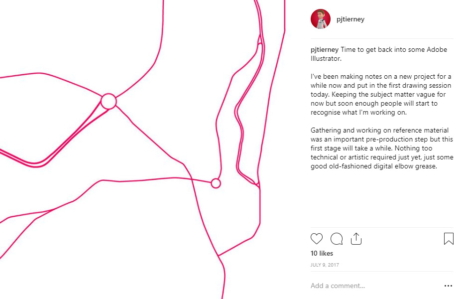

The first step was to draw out each of the roads, and then lay the race routes on top of them. I stitched together my map screenshots into one large image and used that as my reference material before consulting the Rivals route screenshots I took to draw the race routes. From the outset I knew this would be a complicated project, so I had to come up with a robust system of naming and categorising each layer/element as I went along.
As with all of my projects I shared daily updates on Instagram with notes and thoughts on my progress. I find that the reactions to these posts generate a positive feedback loop that helps me to push forward to completion.
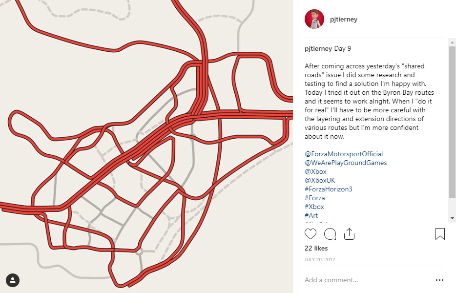
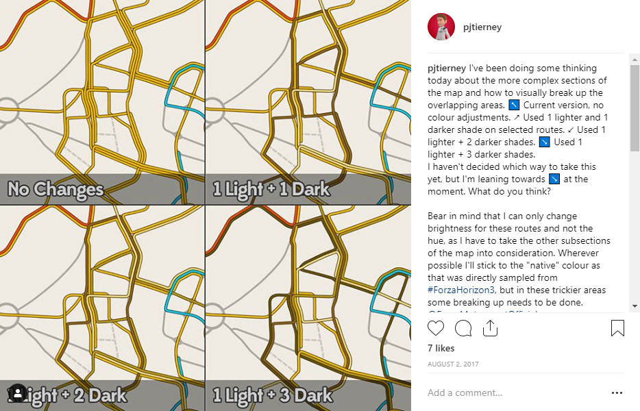
With the roads and routes placed down the next challenge was to find a workflow for splitting the routes along the roads that they shared. This turned out to be rather tricky but after some research I stumbled across the Transit Maps blog, which helped me come up with a solution for visually separating the routes.
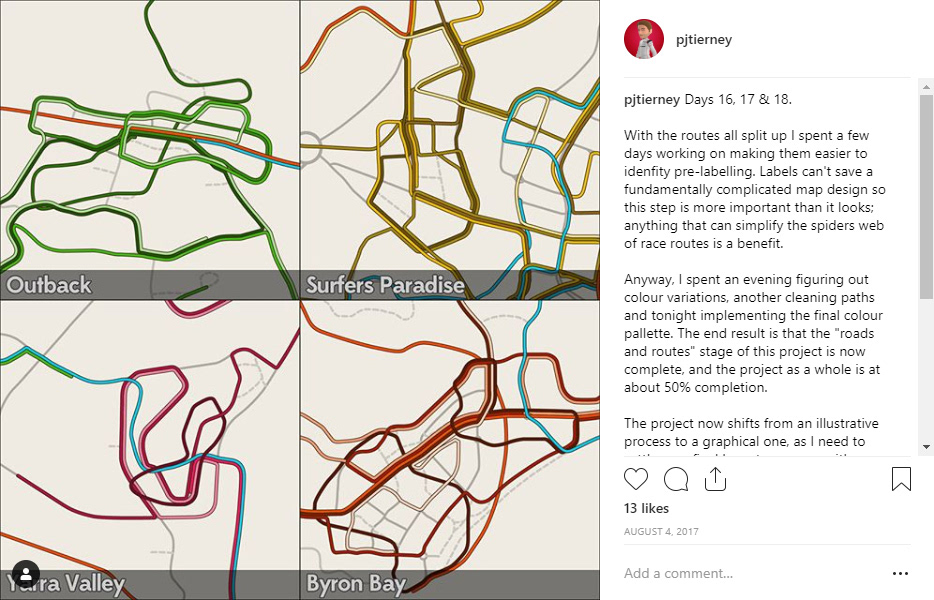
A long process of separating each route then began, and once that was done I set about visually separating them by colour. Again that was a tricky one to find a solution for but a few artists on Instagram helped out after I asked for some feedback.
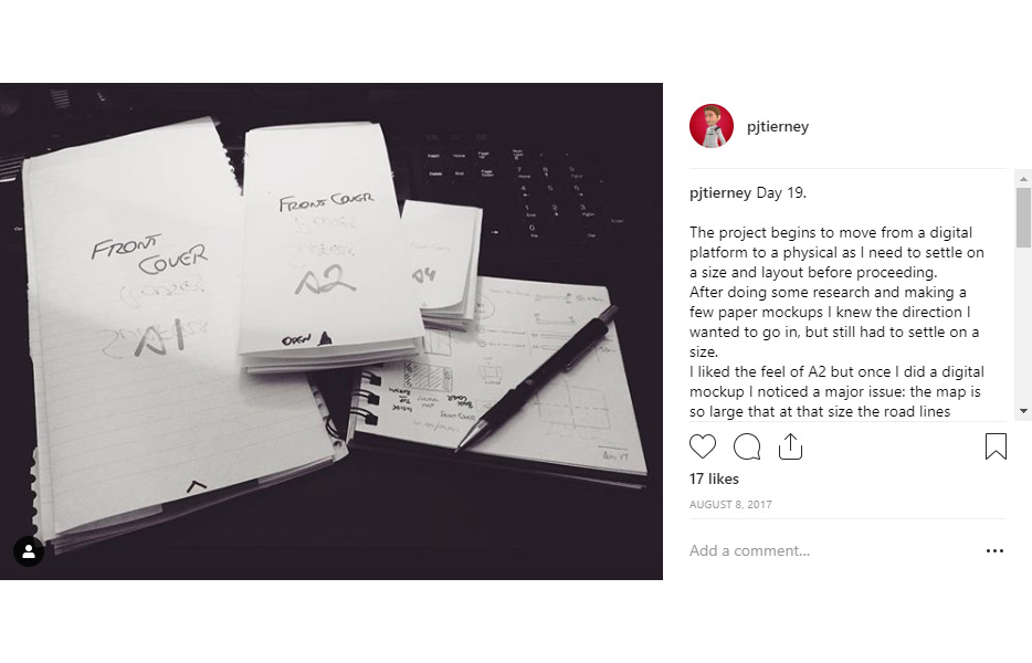
With the main element of the project at a suitable stage of progress I began to think about how to turn this illustration into a final product. Before doing that however I had to settle on a size as that would dictate how large I make the hundreds of icons and text fields that I was about to create. That meant taping together some physical sheets of A4 and experimenting with different folding patterns.
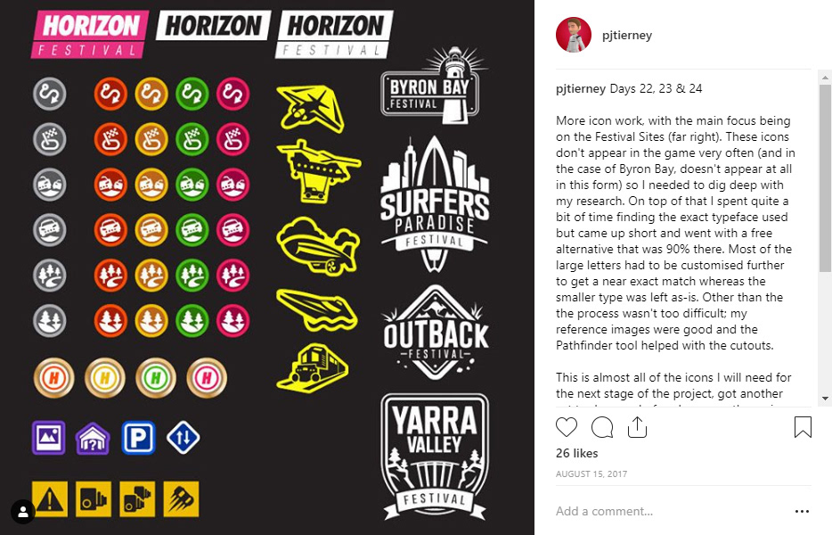
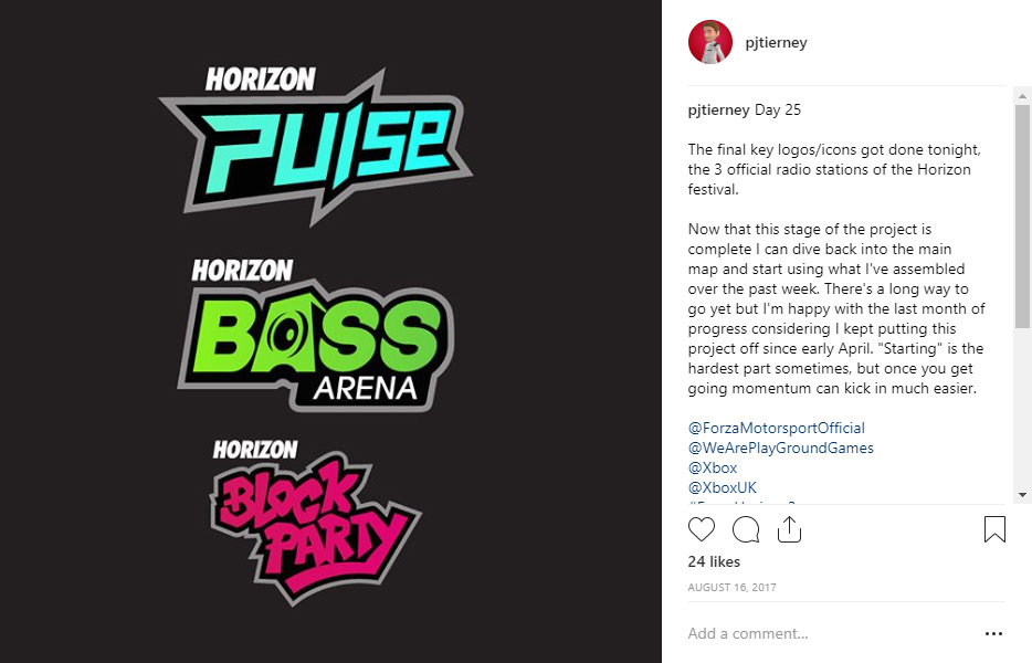
The next key stage of this project would be to create the icons that would be used across the map. In order to make the map feel like it was a part of the game’s fiction I took inspiration from the game’s iconography, recreating many of the in-game symbols.
I also had to create a number of elements which didn’t already exist in the game (such as the Byron Bay Festival badge and a collective logo for Horizon Showcases), making sure to match the design rules of the other elements in order to maintain consistency.
I may not end up using all of the elements I (re)created but having them available to-hand meant that I was ready should an idea come into my head.
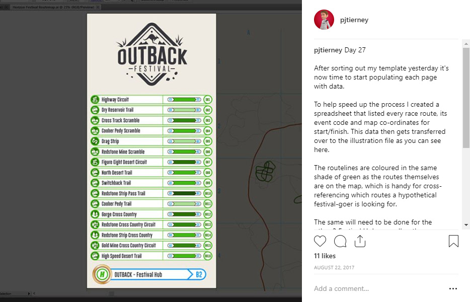
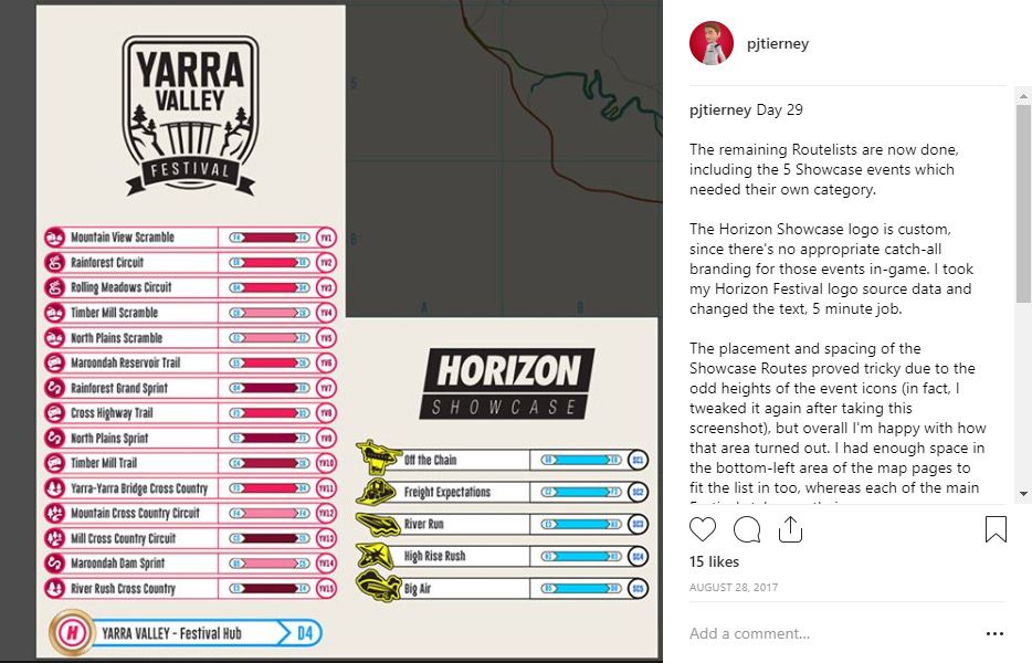
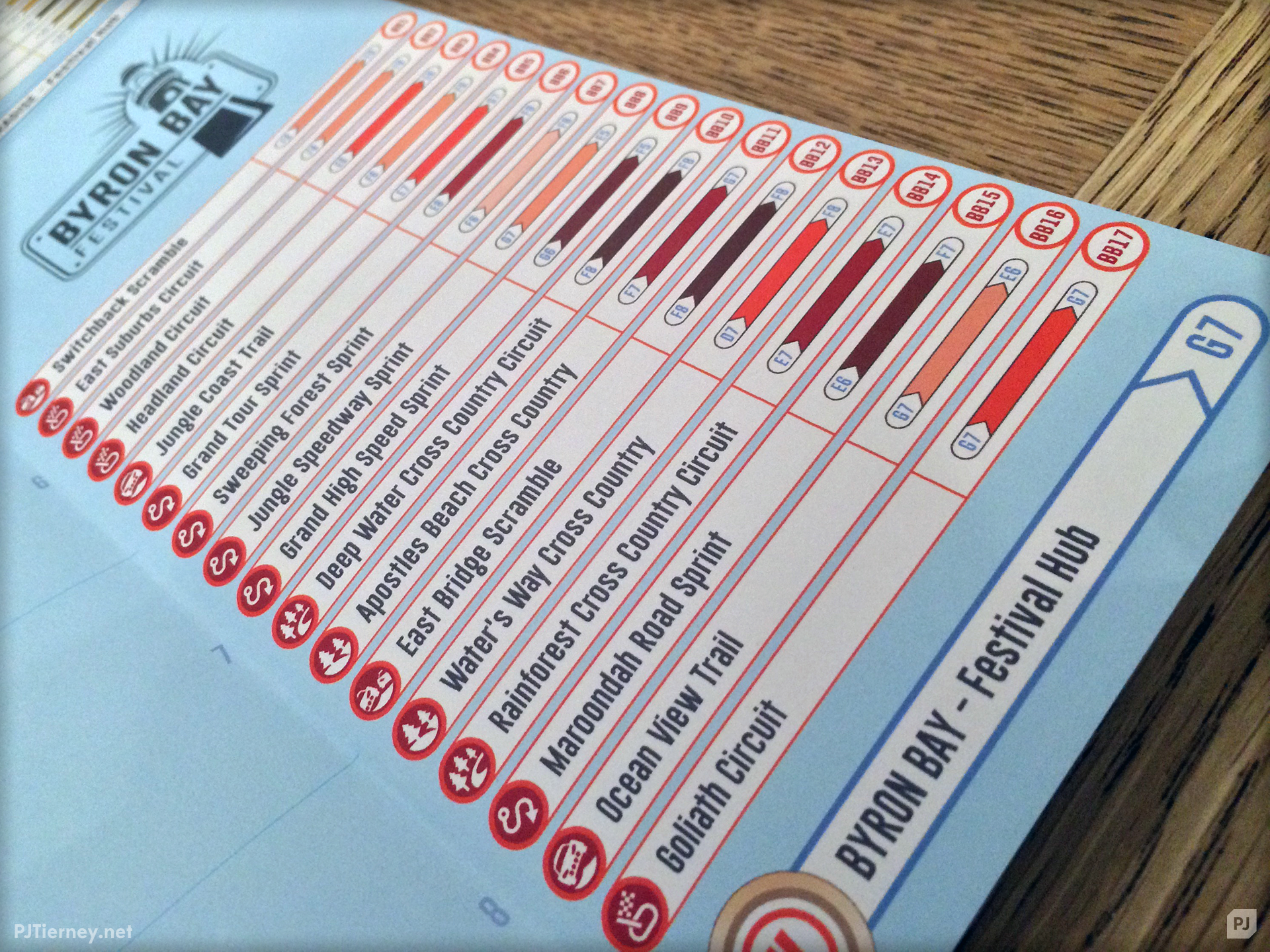
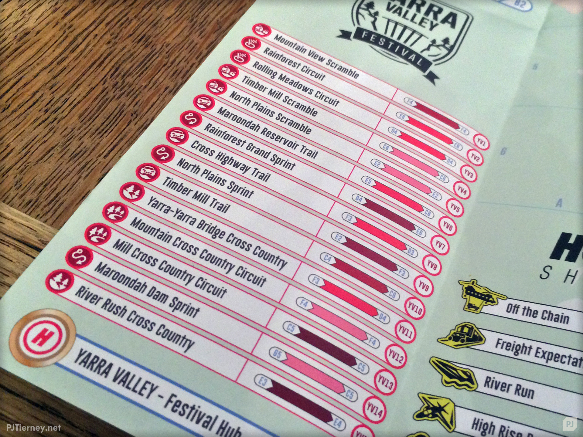
Following on from this came a process of creating the routelists that would sit on either side of the map itself. In assembling these I had to come up with a visual language that would make sense for a user of this map. I didn’t want to create a “legend key” for this map at all as I already had so many icons and elements to add; I wanted it to be somewhat intuitive what each piece of the display referred to. That meant coming up with a visual language that would be consistently applied across the entire map.
The routelists show off this entire visual language with a single image:
Event icons are the same as those used in-game, denoting what kind of race a visitor would be seeing.
The bar to the right of the route name was coloured based on the colour of the route on the map, with the start and end of the bar shaped to match the start and end point labels on the map itself.
Map co-ordinates were always displayed in light blue.
Each event was also given a code (YV10 etc.) which was then used on the route labels on the map itself as cross-reference material.
My aim with all of this was to make the lookup process as intuitive as possible, as I believe telling somebody how your visual language works could be potentially seen as a failure of said language to communicate properly in the first place.
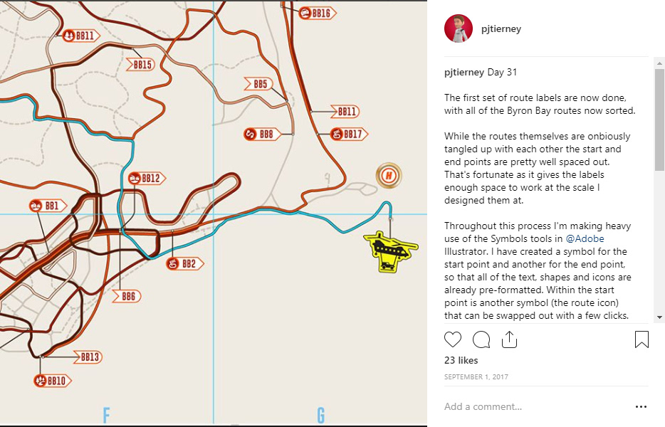
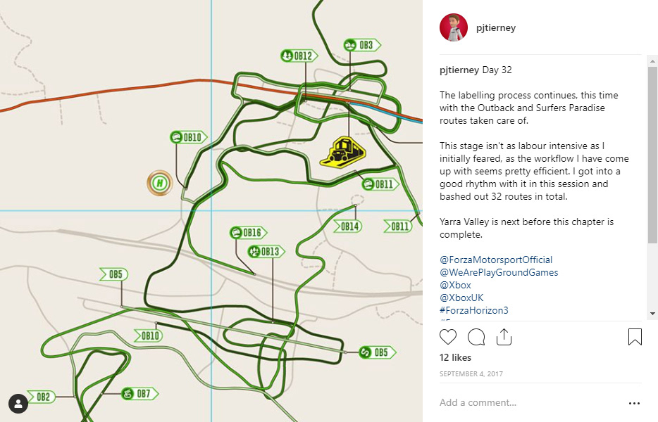
The final stage of the main map was to then add the labels for each route. These would follow the same visual language as the routelists.
As with each stage of the project I was able to come up with a workflow that drastically sped up the entire process, this time using Illustrator’s Symbols tool to create a base element and then swapping out text/icons as required.
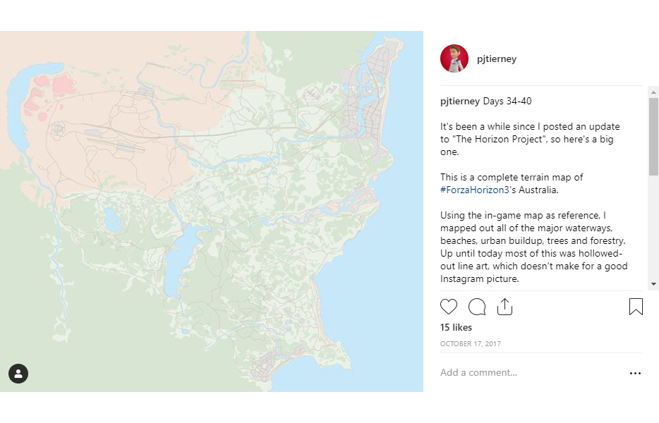
With the main map and its iconography complete I was reasonably happy with how it all looked but felt that the project was missing something… so I created a full terrain map as well and expanded this into a double-sided illustration.
Another round of map research was conducted and I came up with a visual aesthetic that would not only work as a background to the routemap but also as a standalone “environment map” designed to show off the Australian landscape.
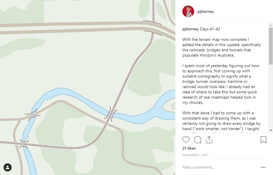
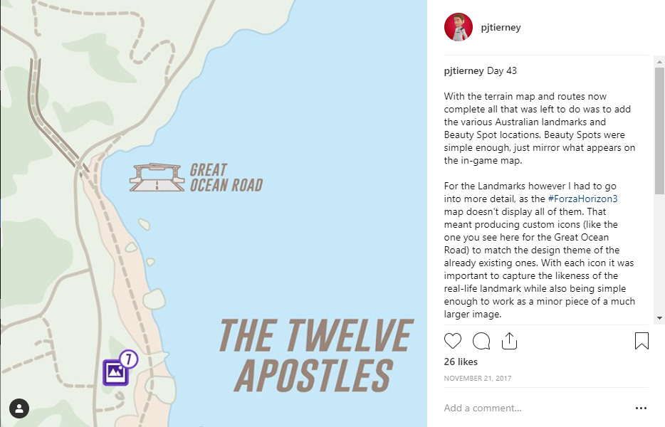
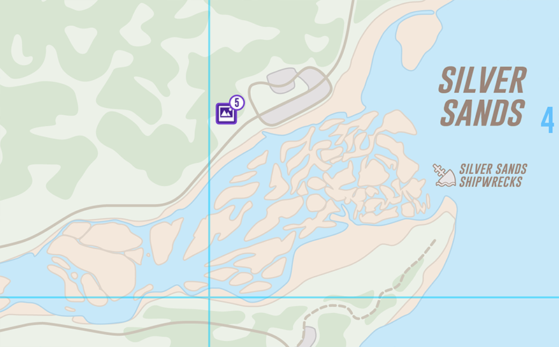
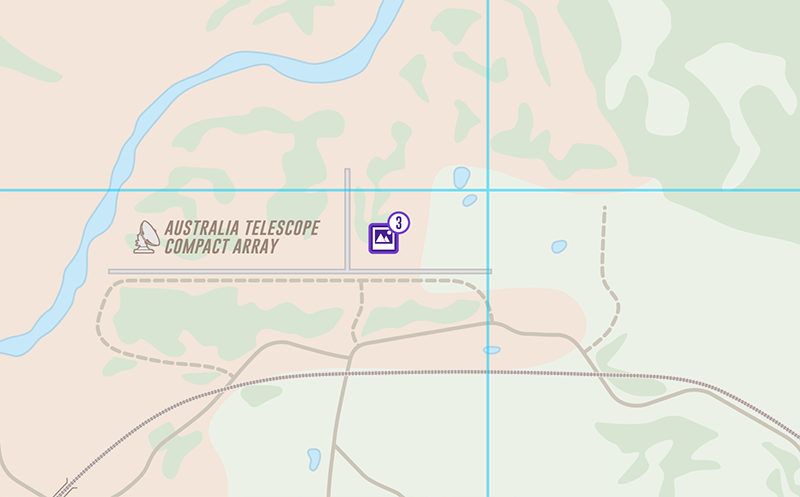
To do this I went back to my reference image and drew out all of the areas of unique terrain; trees, water, sand, urbanisation, the lot. On top of this I added elements that wouldn’t be visible on the routemap in order to flesh out the environment map a bit more. Markers for bridges and tunnels, icons for landmarks and co-ordinates for the game’s “Beauty Spots” were all added.
In theory, this side of the map would be used by festival-goers who just wanted to experience the beauty of Australia without having to deal with all the races and events of the Horizon Festival.
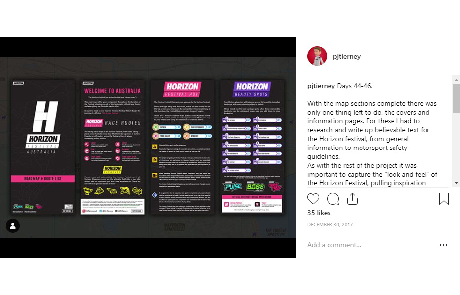
The final stage of the project would be to create the front and back covers of the map, providing information on the Horizon festival’s features and also adding essential driving/safety information for attendees.
Forza Horizon 3 is a casual racing game and many of the driving feats you accomplish are either unsafe, illegal or impossible in reality so i figured I’d reference that in the documentation as well.
After about 80 man-hours or so the project was completed in December, leaving only one thing on the to-do list, printing.
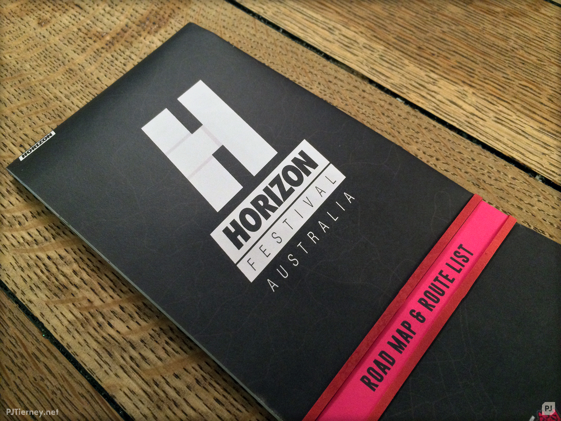
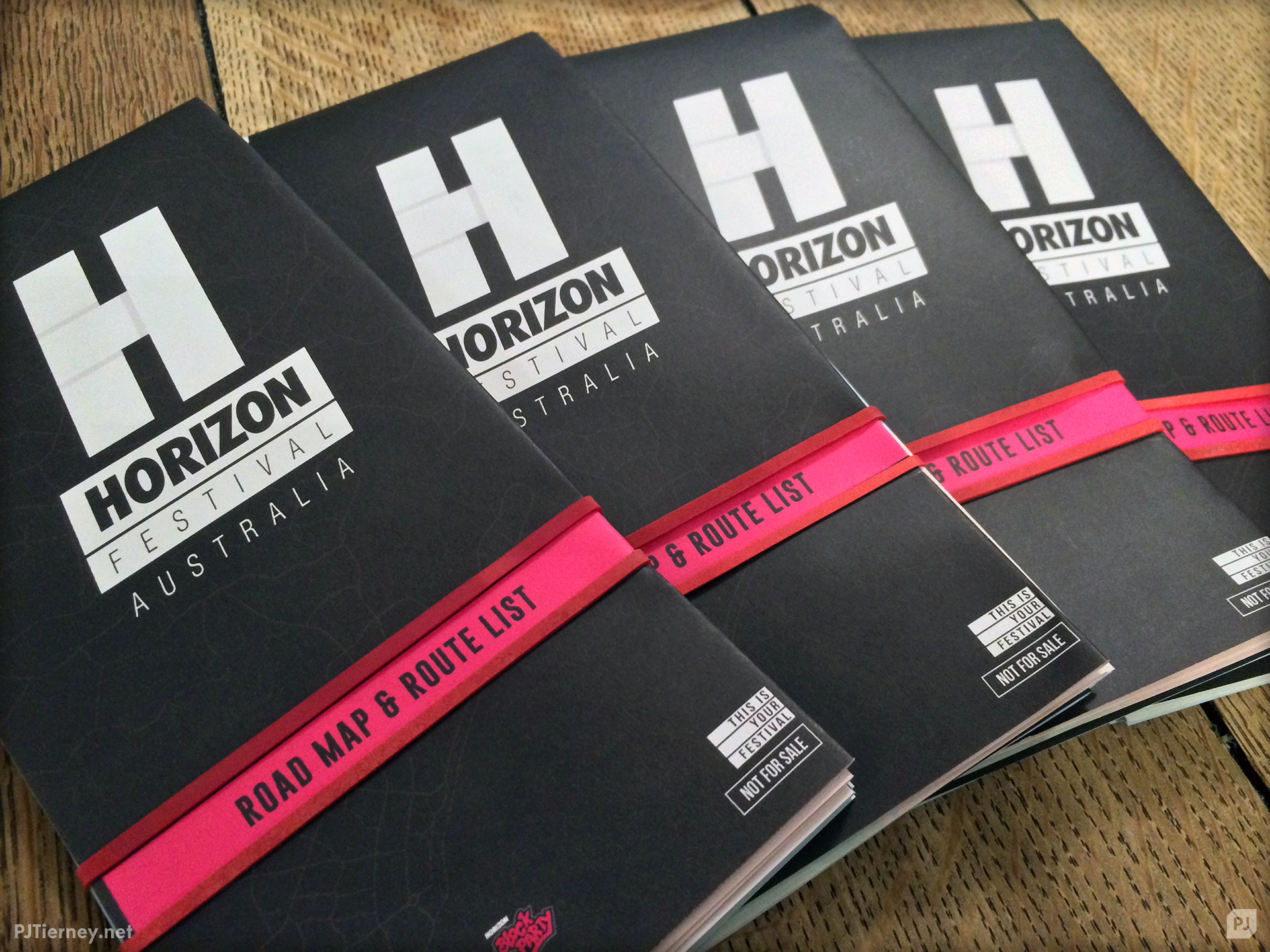
With the design work completed I set about getting a few printed, mainly for my own personal use but also some extras as gifts for a few people. Fortunately I knew a local printer who was very helpful in offering quotes and advice on file preparation.
Prontaprint have been reliable with work-related projects in the past so I knew they’d do a good job with the final printing of these. I ended up going for a matte finish on the maps as that was similar to real-life road maps I had seen and in the context of the Horizon Festival I’d expect them to be written on, with festival-goers marking down the races and attractions they’re most interested in seeing.
Overall I am quite happy with how this project turned out. It was my first time making anything map-related and while I’m sure I could do some things better were I go give it another go I’m pleased with what has been created.
In the end it gives me further appreciation for the hard work that went into the creation of Forza Horizon 3′s Australia, a game I still enjoy to this day.
This is an unofficial, fan-created project expanding on the in-universe fiction of the game depicted.
Any trademarks, logos, and brand names represented in this illustration are the property of their respective owners. No connection with any company is to be implied unless otherwise stated.
Any trademarks, logos, and brand names represented in this illustration are the property of their respective owners. No connection with any company is to be implied unless otherwise stated.
“Forza Horizon 3” © Microsoft Corporation.
“Horizon Festival Route Map” was created under Microsoft’s “Game Content Usage Rules” using assets from “Forza Horizon 3”, and it is not endorsed by or affiliated with Microsoft.
For more information visit http://www.xbox.com/en-GB/developers/rules
“Horizon Festival Route Map” was created under Microsoft’s “Game Content Usage Rules” using assets from “Forza Horizon 3”, and it is not endorsed by or affiliated with Microsoft.
For more information visit http://www.xbox.com/en-GB/developers/rules
This item is not for sale and if you received it as a gift it cannot be re-sold, as per the “Game Content Usage Rules” agreement stated above.